If you can’t be bothered reading all 2500 words, here’s the finished magazine.
I want to make the magazine look as if it were a house, so I’d have the front of a mansion on the front page and the back of a mansion on the back page.
I want to have a kind of fictional narrative within the magazine. My idea is to have some kind of deity art collector in the afterlife, but instead of collecting artworks, he collects the dead artists themselves, against their will. I want this character to be like a psychotic god with a short temper. He will serve as a guide to the through the magazine as if he is taking the reader on a personal tour. All the information that I’ll write about each artist and movement will be in the form of his speech.
So each page will be dedicated to the most famous artist in each of the 11 movements that I’ve researched. Each movement will be in a different room. I will draw each artist in some kind of cartoony style, or make a collage. In each room, the art collector will talk about the artists.
I need to figure out the general layout of the pages, like I was thinking I could make it like a comic book, with multiple panels on each page, which would work for my more narratively driven idea, but that would take a lot of work, and I don’t really want to do that.
It’s so weird, I came up with this idea by myself, and now I’ve heard that at least two other people in my class have portions of the same idea, like one person is doing the house idea and is having the front page be the front of a house and the back page being the back of the house, and another person is doing the tour guide idea. I guess that the only unique aspect of my idea now is that it’ll be set in the afterlife with a demonic god-like tour guide.
The first thing that comes to mind when thinking about this character is an old fashioned, posh robe like the meerkat from the compare the meerkat.com adverts. Whatever character I come up with I want them to wear a robe like the one that the meerkat wears.
So I guess that one of the first things I need to do is design the tour guide character. I’ll make a mood board below for inspiration. If the character is going to be a god or devil-like figure, I could start looking at different kinds of religious iconography.


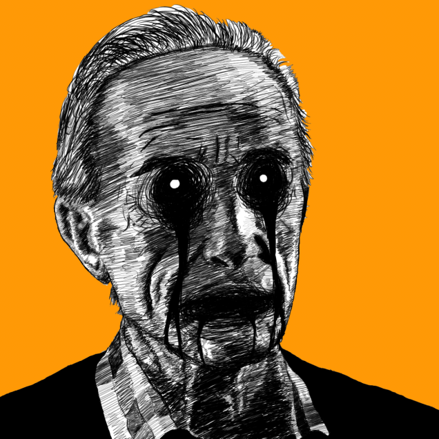
I like the idea of having a skull-like face with creepy eyes in the eye sockets.


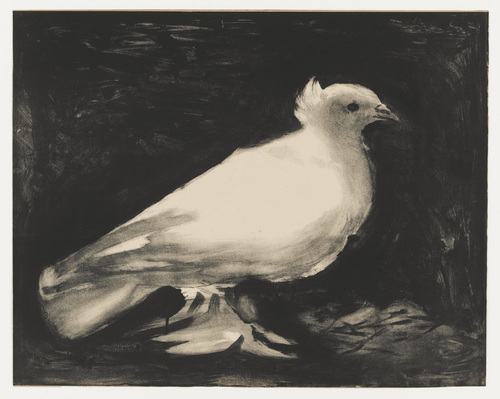
I started doodling some ideas, starting with trying to draw the witch’s face from The Theif and The Cobbler, as seen above, and the witch’s nose from the other picture.
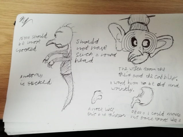
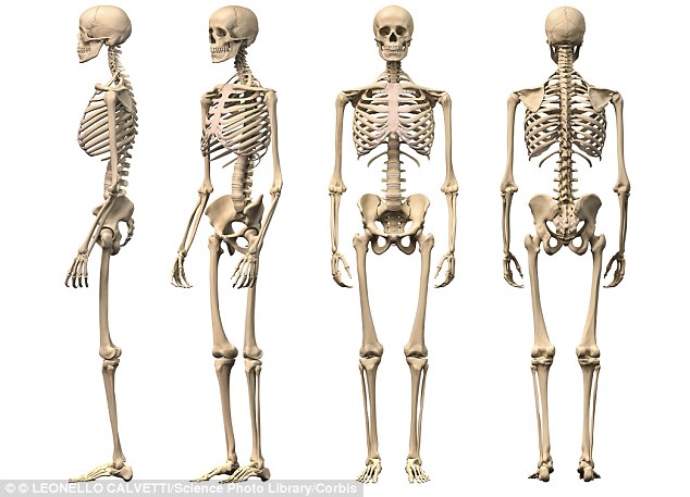
I then drew one of the skulls as a head for the robe in the picture above and used the picture below for reference.

I really liked this design, but I kept experimenting. I used the shape of the skull in the reference picture to try and make a gaunt, thin-looking face, but it didn’t really look too good, so I drew the skull again, but gave it the witch’s nose from earlier. I really like the result, he looks kind of spooky, but the nose also gives him a kind of likeable aspect. I’m going to go with this design.

Next, I’m going to make a vague template for the magazine pages. Below are a bunch of images that I used for inspiration.


")

And these are my thumbnail sketches.

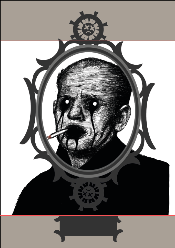
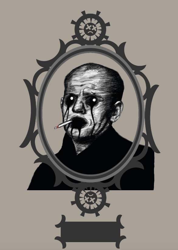
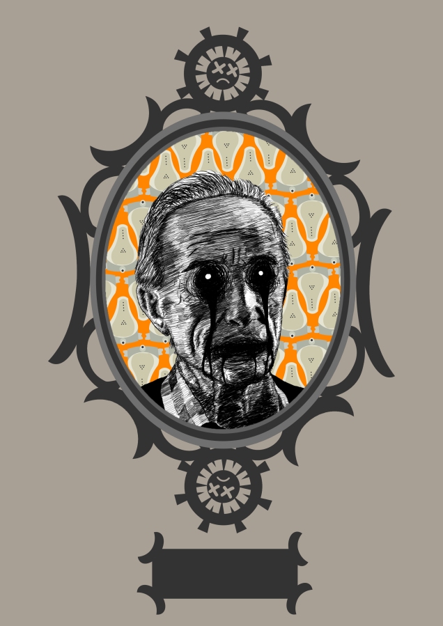
I then drew my skeleton tour guide in Krita.

Then I started work on my front cover. Here is the tree I drew in Photoshop. I duplicated and flipped it a couple of times, to make the eventual image more crowded with trees.

After messing around in Illustrator for a couple of hours, here is the final image.

Next, I created the hallways that were shown in the thumbnail sketches. I found this image and used it for reference. I followed the design of the picture so closely because I can’t portray perspective accurately out of my imagination.

This is the result.

I want there to be a really long hallway, with a bunch of sets of pillars, so that for every 2 pages, I’ll decrease the length of the hallway, so that it will appear to the reader that they’re slowly progressing through the art gallery hall.
So this is what the hallway before the above image will look like, and so on.

This will be the 1st page of the gallery.

For the last page of the gallery, I’m going to make a double-page spread of a close up of the back wall, which will have some tools lying around, and an “Under Construction” sign hung up on it, and the skeleton tour guide will explain that he’s waiting for the next great artists to die, and art movements to spring up.
I’m going to create the tools I just talked about. Here are some reference images I used.


So then this is what the result looks like.

And then I copied and pasted it onto every back wall.

But first, I need to draw the bog-standard frame which all of the paintings are going to be held in. Here are some reference images that I used.

I copied the design very closely, except for the fact that I couldn’t be bothered to add the flowery details, and I made my own design for the middle top and bottom bits.

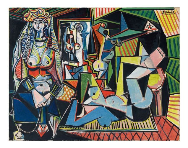
Now that I have all of the hall artwork done, I’m going to make the individual artworks for each art movement, starting with one of my favourites, Andy Warhol from Popart. I’ve had the idea to show him eating out of a Campbell’s soup can, so I’mma go do that now.
I want my drawing of Andy Warhol to look kind of ill and malnourished, hence why he’s scoffing Campbell’s soup, so I found this picture which seemed fitting.

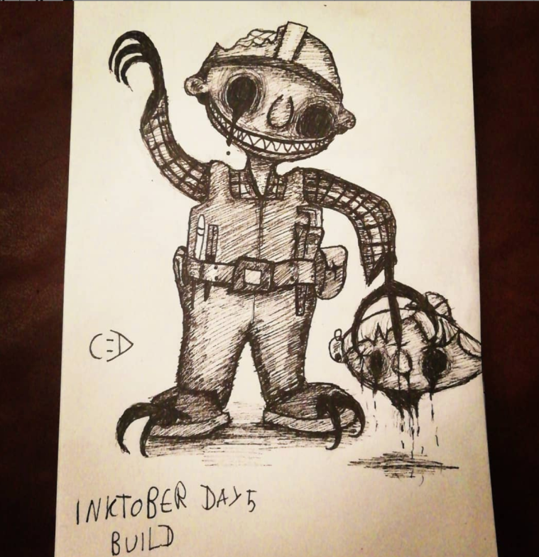
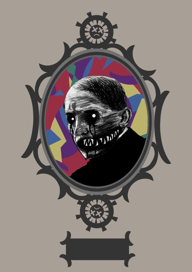
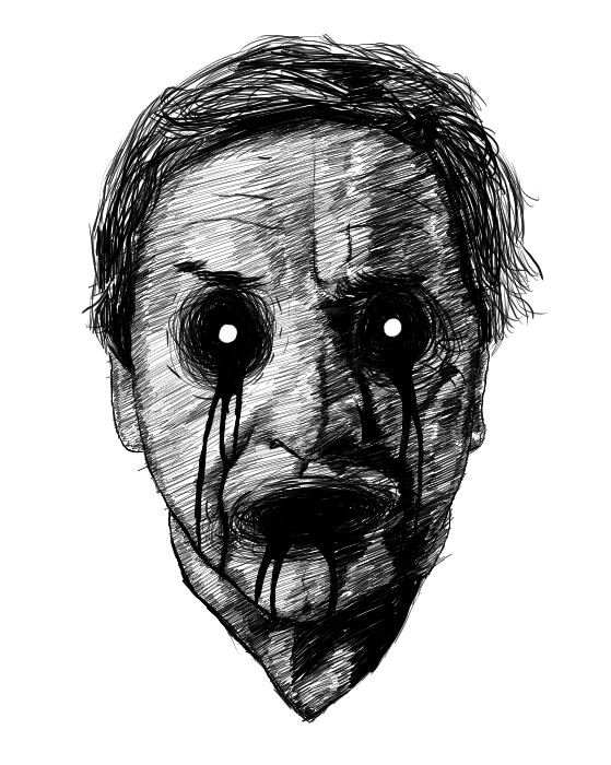
I wasn’t sure how I wanted to draw these artists, then I realised that I could draw them in my creepy style, which would fit with the whole afterlife idea. This is a drawing I did of Bob The Builder recently, in said style.
So I drew over the picture of Andy, and just went all out with the creepiness, and had a lot of fun doing so. I would not want to see him in a dark street, that’s for sure.

I like the result so much that I’m going to draw every artist like this. Yay!
Now I’m going to draw some Campbell soup cans. Here’s the image I used for reference.

This is my version.

Now I’m going to compile everything into a handsome little page.

I made the background the same colour as the pillars, so it looks like it is on a pillar. I realise now that some of the soup cans and the details on the frame are wonky, but I just can’t be bothered to change it so I’ll just leave it wonky and imperfect, like most art.
I’m also going to put some text on that little box under Warhol, but I’ll do that later when I have more time.
Next is Surrealism, and Salvador Dali!
Here is the photo that I used.

And 5 hours later, here’s my drawing. I did pretty much the same thing as the Andy Warhol drawing, but I added white spots in his dark eyes, which looks more stylised and really adds to the creepy vibe. I’m probably going to do most of the artists with those white eyes now.

Now I’m going to draw a surrealist, Dali-esque background. This is the image I used for reference.

I created this.

Then this is the whole scene put together. I can’t figure out how to crop Dali, but I will.

I went into photoshop and edited that overlapping black bit out.

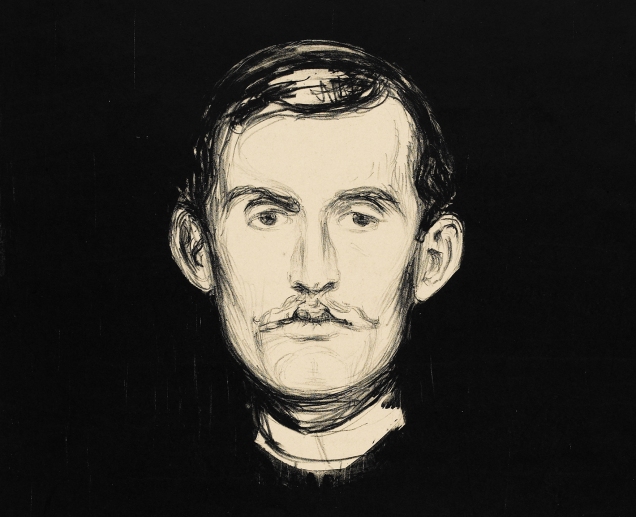
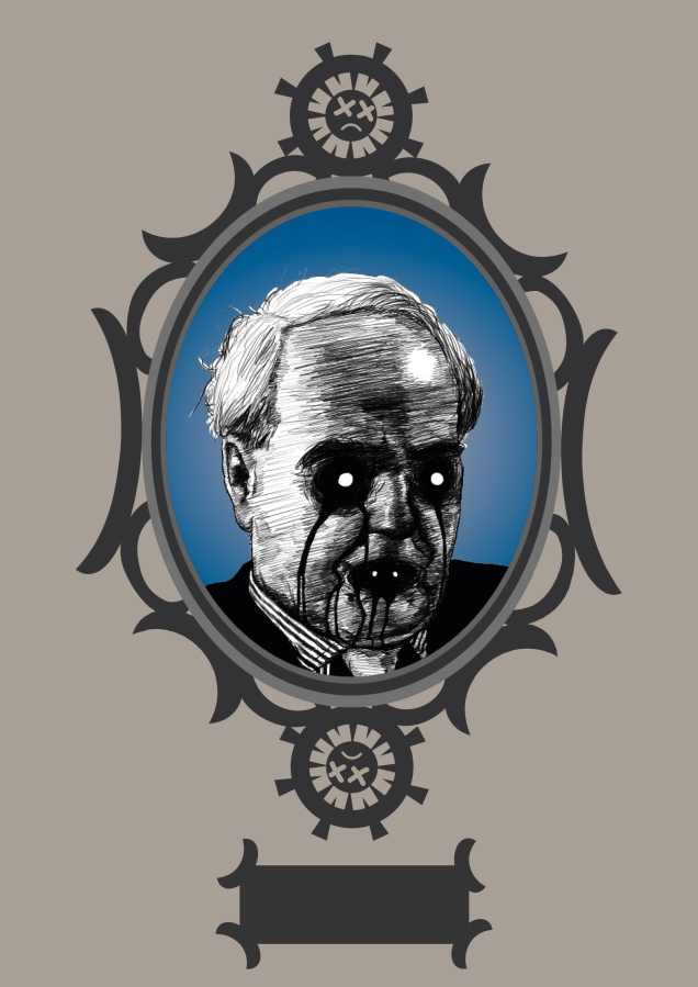
I’m drawing my favourite artists first so that it is more interesting. Right, next is Edvard Munch for Expressionism!
Because I couldn’t find many pictures of Edvard Munch when he was younger, I’m using this self-portrait drawing by the man himself, Edvard Munch for reference, as it is the most useful self-portrait of his, in terms of contrasting tones in the face.
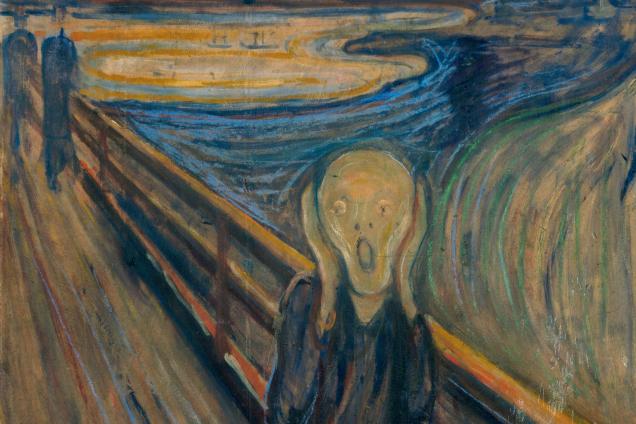
I had an idea that I wanted to make the drawing look kinda like the scream, so here it is.
This is my drawing.

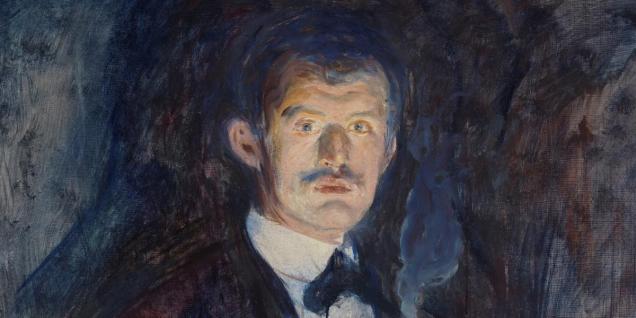
I tried drawing a background for the painting that was inspired by the background in The Scream painting, but it looked like a toddler with no artistic talent had made it, so I opted for a much simpler background inspired by another one of Edvard Munch’s self-portraits.
And here is the result.

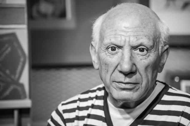
Okay, onto Picasso for Cubism!!
I used this picture as a reference photo.
And this is my drawing. My mate @outlawzipi (Instagram) had the idea to draw the creepy teeth, which really helped the picture to be extra creepy.

Now I need to make a background for good ol’ Pablo. I found this Picasso painting and used it for inspiration for the background.
So then I made this.

Then I duplicated it a bunch of times, and this is the final result.

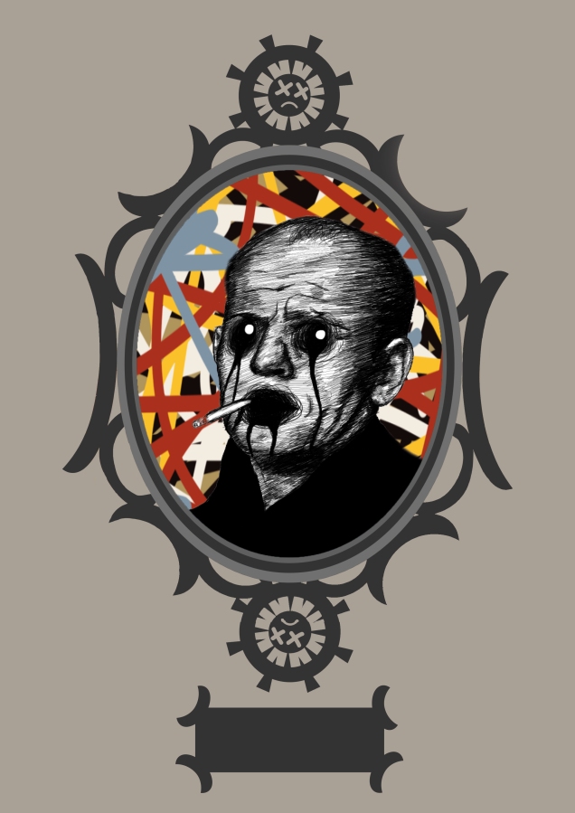
Next, onto Abstract Expressionism and Jackson Pollock!
This is the reference photo I used.

And this is my drawing. I realise now that his cigarette is just kind of floating there in his mouth… oh well, I still like it anyways. You’ll just have to suspend disbelief.

So because I’ve made all of the drawings from this point on in Krita, instead of Photoshop which I’ve used for all the others, I couldn’t figure out how to export my drawings with a transparent background, so no all of the drawings just look like is.
So I’m now going to go into Photoshop to try to solve this.
Tada!
And then I went back into photoshop to get rid of those black bits.

So I’ve got to go through that process for all of the drawings from here on out, and because it is going to be extremely tedious to show all the screenshots for each drawing, so just assume that I’m doing it behind the scenes.
So I’m now going to make the background to the frame. This is the reference photo that I used.

And this is my terrible Pollock-Esque painting that took me about 30 seconds to make.
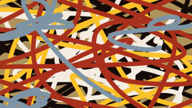
And then this is everything together.
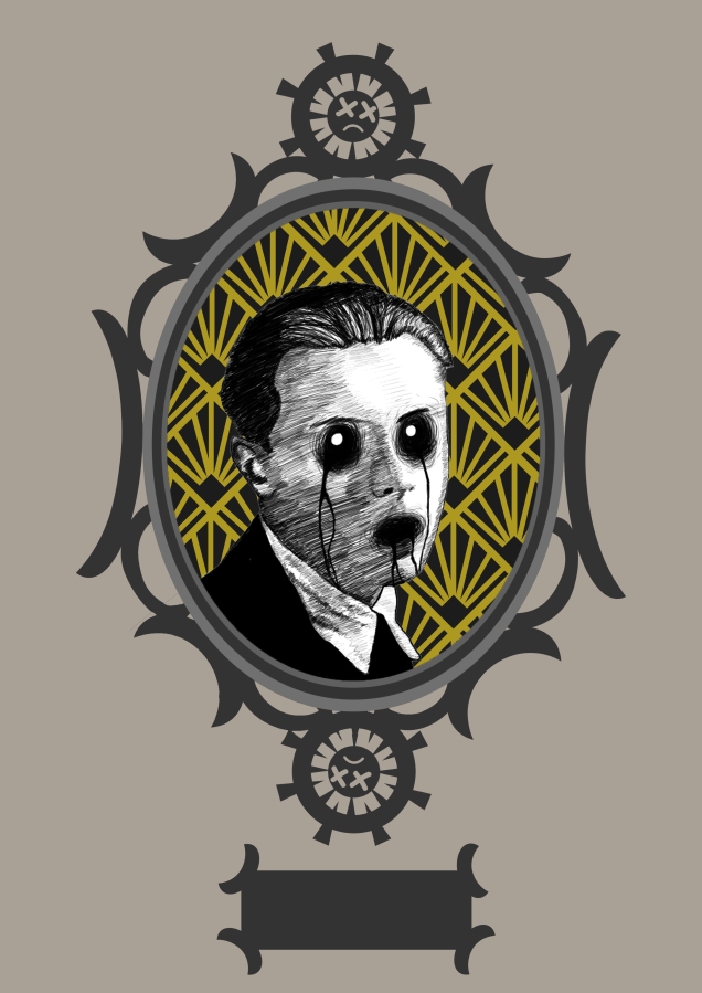
Next is Art Deco and Erte!
This is the reference photo I used.

And this is my drawing.
This is the reference photo that I used for the background. I don’t think this image was made by Erte, but it is very reminiscent of the Art Deco period, so it still works.
/wall-murals-art-deco-seamless-vintage-wallpaper-pattern.jpg.jpg)
So I made my own version of one of the diamonds. It is not quite symmetrical, but oh well, I don’t have time to change it now.

Then I duplicated it a bunch of times, and this is the end result!
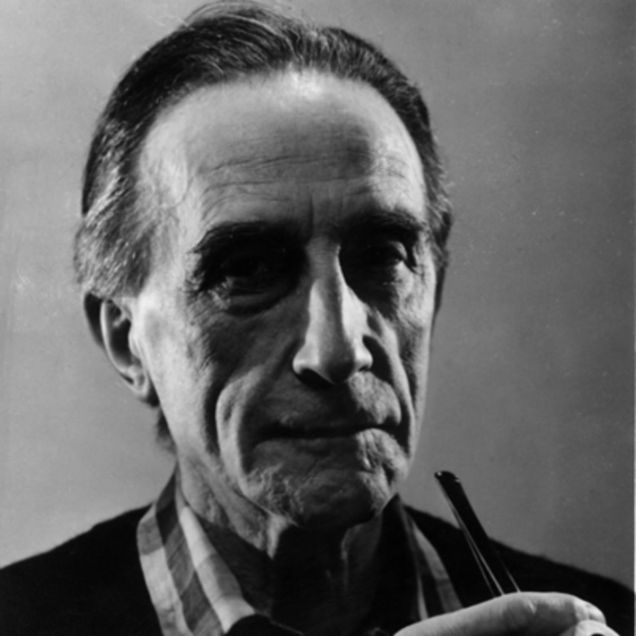
Next, onto Dada and Marcel Duchamp!
This is the reference photo that I used.
And this is my drawing.

For the background, I used this piece of his art as a reference.

And then this is my version of it. It’s not perfect, but it’ll do

I was messing around with ol’Marcel, and I did this. I’m not going to use it because it doesn’t fit in with everything else, but I really like the effect.
Okay, actually, turns out I’m going to use this. I duplicated the toilet thingy a bunch of times and made a repeat pattern with them. This is everything put together.
I felt like the background was too bright, and took too much attention away from the main drawing, so I put a dark blue square with very low opacity in front of the background to mute the colours somewhat. I’m happier with the result.
And next, onto Futurism and Umberto Boccioni!
This is the reference photo that I used.

And this is my drawing.

This is the reference photo that I used for the background. It is one of his paintings.

So using this as I reference, I made these shapes.

I then threw them all together to make a messy background and put a big dark blue square over them and turned the opacity way down, to make the shapes darker, because I felt like they were too distracting from the drawing in the middle.
This is everything put together.
Okay, next up is Modernism and Henry Moore!
This is the reference photo that I used.

And this is my drawing.
I feel like I’m cheating by drawing over the photos, but oh well, I don’t have time to draw these pictures freehand.
And this is my drawing. I put two little white eyes in his mouth to try to add to the creepiness.

Because Henry Moore seemed to mostly do sculptures, I couldn’t think of how to make a background for the painting, so I just did a simple blue square with a white radial gradient.
So this is everything shoved together.
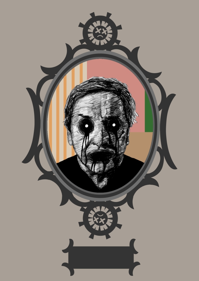
So next up is Postmodernism and Han Sai Por… well, at least she was going to be next, but then I realised that she isn’t actually dead yet, and that’s the whole idea behind this magazine, these are all dead artists. So I’m instead going to do Robert Rauschenberg, who is, in fact, already dead. So yay!
So this is the reference photo that I used.

And this is my drawing.
I used this photo of one of his works for reference for the background.
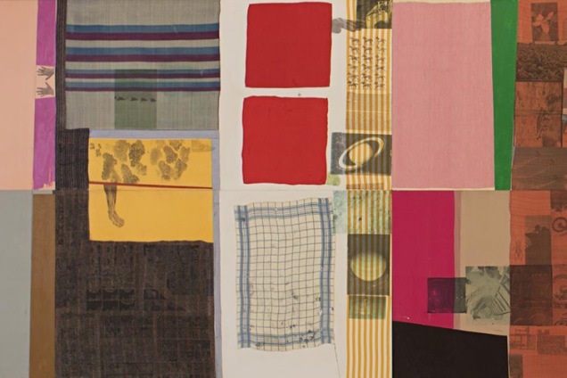
And so I made this.

and then everything squished together looks like this.
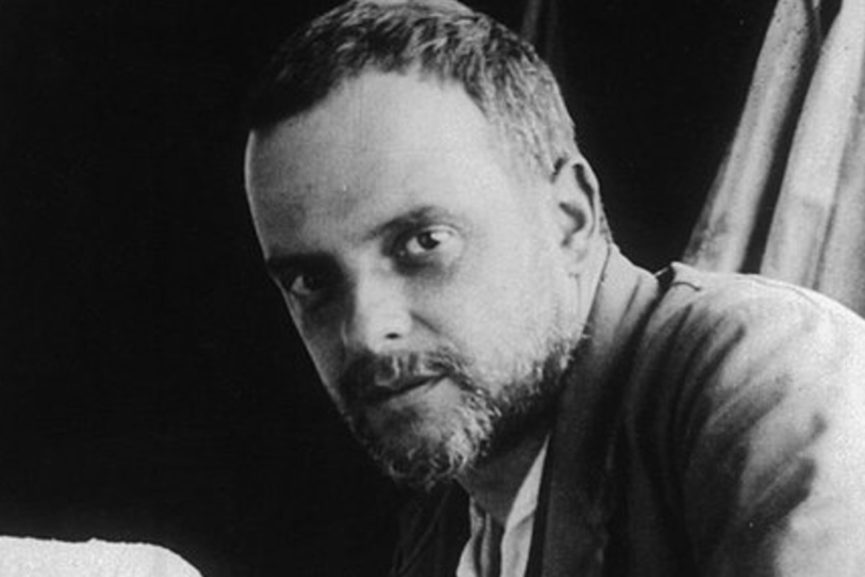
And now onto YBA (Young British Artists) and Mat Collishaw.
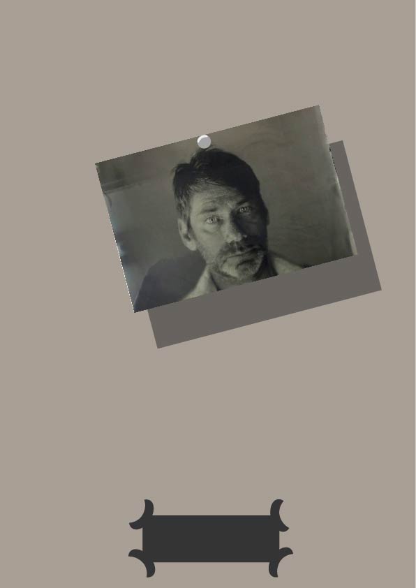
Now, we have a problem, because Matt Collishaw is not actually dead yet, but I really want to include him in this magazine because he is my favourite artist, and is one of the reasons I’m so passionate about art.
So instead of drawing him, which would imply that he’s dead, I’m going to stick a picture of him up on the wall, as if the skeleton tour guide has done it, and he’s waiting for him to die.
So this is the picture that I used. I like this picture because it kind of looks like a formal mugshot of him.

And this is everything.
I then made the back cover image. It’s got weird lines over it because I screenshotted it in Illustrator.

I then went into Adobe Indesign and compiled everything together. I made it very comic book-like, with speech bubbles and whatnot. I also tried to make the magazine more interesting by adding dialogue between the skeleton and the artists, which develops a tiny bit of narrative, so that as you read through it you gain insight into what kind of a person the skeleton really is.


.jpg)