I’m actually really happy with the result! It is simple in design, as it does not overload the eye, and it tells the viewer what they need to know, without any unnecessary details.
Whilst I was trawling through game posters, looking for inspiration, I found a series of posters by a guy called Dylan West. The extreme visual appeal of these images inspired me to have a go at making one myself for Transpigeon. Here are some examples of his awesome work.
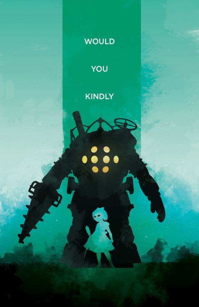
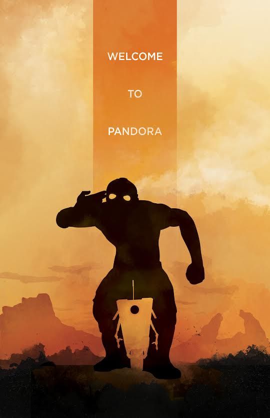

As you can see, the main character is defined by a black silhouette which is contrasted on a bright, monotone background. A silhouette the same colour as the background is positioned between the legs of the original silhouette, which is in the shape of a character related to the main character in the image. This shows a connection between the two characters.
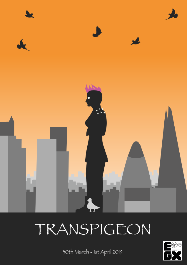
With my poster, I wanted it to have all the visual appeal of the above images, but also tell the observer enough about my game to garner their interest enough to hopefully theoretically buy my imaginary game.
My poster tells the viewer that it is set in London, it shows the personality of the main character, expressed through her clothes and hair. It shows the connection between her and the silhouetted pigeon on her feet and that she will transform down into it. It tells you the title and other relevant information.
There are also a swarm of pigeons flying around in the sky, which reinforces the massive theme of pigeons in the game, and also makes the poster feel alive, and not just dead and stationary.
P picked the colour orange for the background because apparently, it symbolises creativity, freedom, happiness, expression and sexuality. I felt like those were all big parts of Mia’s personality (the character in my poster), so I just had to use orange for the background.
