I had made the kiosk a couple months ago, but I had forgotten to upload it, so here it is.
I had made the kiosk a couple months ago, but I had forgotten to upload it, so here it is.
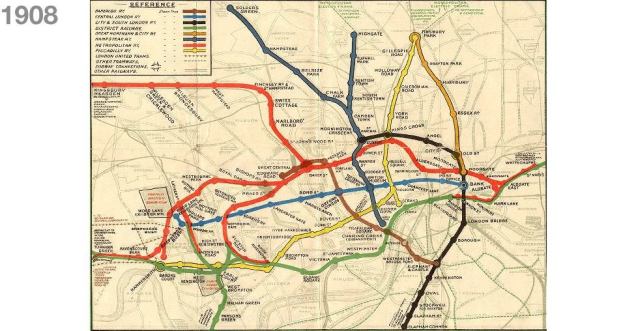
Harry Beck was an English draughtsman who created the present London Underground Tube map in 1931. Beck drew up the diagram in his spare time while working as an engineering draftsman at the London Underground Signals Office.
/cdn.vox-cdn.com/uploads/chorus_image/image/61158327/beck_image.1419979424.0.png)
After years of working for the London Underground, Beck became fed up of the very complicated and overcrowded underground map, so he devised his own design. The original map showed all of the stations exactly where they were in real life, which meant that there was a mass of messy squiggles and station names splattered everywhere, because the tube lines bend and weave everywhere. And what’s worse is that the map even had the thames and some above ground roads displayed on it. All of this made it very hard and confusing to navigate.
So Harry Beck decided to scrap the idea of portraying every station in their real-world location, and instead opted for a much simpler design, where all of the stations were equally spaced apart, no matter how far apart they were spaced in real life. The map only portrayed the stations, and ignored everything above ground, except the Thames. The bends were always positioned at either a 45, or 90 degree angle. He changed the colour of some of the lines, most notably the circular line, which he made red; this was a clever idea because red draws the eye’s attention more than any other colour, and the central line runs through the middle of london, so it is one of the most important lines, that the most amount of people would be using, so he made it easier for the majority to locate their desired stations.
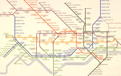
He was very proud of his map, and since he thought it was a much better improvement on the then current map being used, he approaced London Underground with his map, but it was too radical and different for them at the time. But he went back and insisted it was better than the current map, and eventually they gave in. The map was very well recieved by the public. So afterwards they commisioned him multiple times for newer versions of his map. And the rest is history.
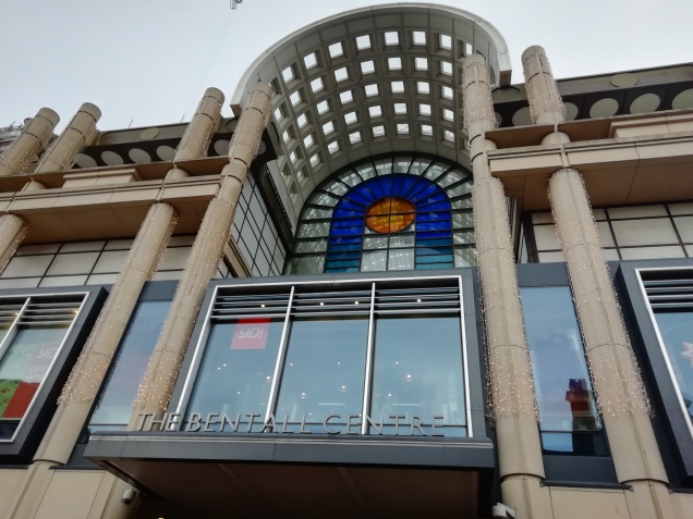
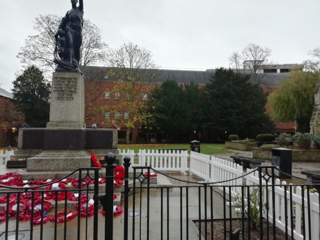
Here are some photos I took of the places in Kingston that I’m going to feature on my map.

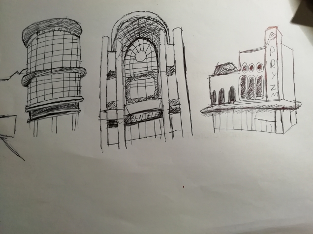
And here are some drawings of some of the buildings I’m going to focus on. They’re not masterpieces, but oh well.
There are hundreds upon hundreds of online maps; hell, Google Maps has online maps for the whole world. Every street is at your fingertips. For my Interactive Map project, I’m going to need to create my own map of Kingston, so it is a good idea to look at some examples of maps for inspiration and to see what I’m getting myself into. Here are but a few of the thousands of maps online.
Here is a screenshot I took of the Kingston Google Maps. These winding roads and streets are what I’m going to be drawing, so I’d better get used to staring at these lines.
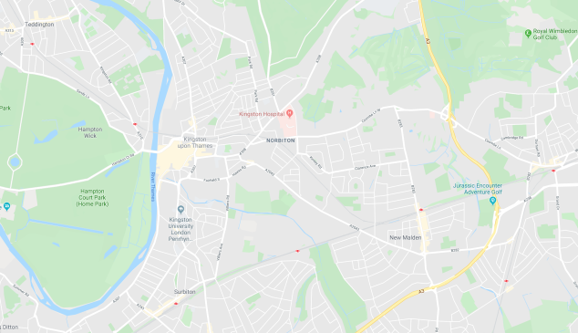
Google Maps use blue for rivers, green for parks, grey for buildings, white for roads and streets, and yellow for motorways.
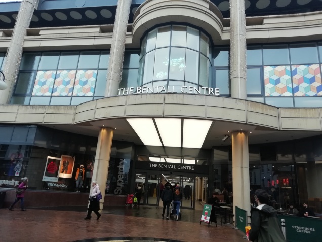
But there are other kinds of online maps. Multi-story shopping centres also use maps. They can be commonly found on kiosks in real life so that shoppers know where they are going and how to get to each shop. They also typically have a list of all of the shops that the shopping centre contains. Here is a screenshot I took of the first-floor map of the Kingston Bental Shopping Centre.

The designers have obviously gone for a different, more slick colour scheme here. Everything is either white or different shades of grey. The design is also very minimalist and simplistic. They seemed to want to make the shoppers feel like they’re in a very fancy, modern posh building, to appeal to mature shoppers.
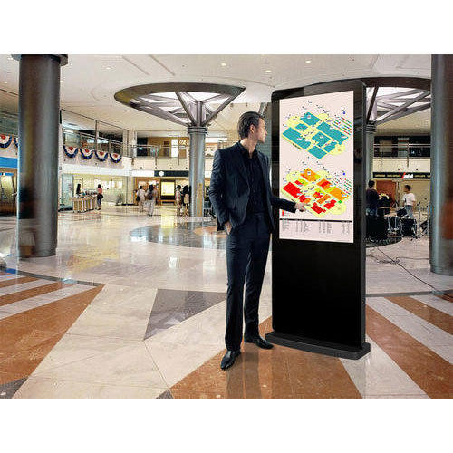
Real-life versions of shopping centre maps are normally displayed on a touch screen, interactive kiosk so that shoppers can browse through the different shops on different floors, which is better than just having a plain, printed out map because they can’t have as much detail. Here is what they typically look like in real life.
But not all maps have this target audience who like different shades of grey in mind when they design their maps. Here’s the map of Lego Land.
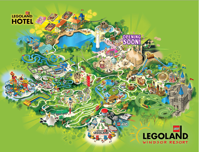
They have used lots of bright, flashy colours to appeal to a young audience who like lots of colours and graphics that almost jump out of the page and has lots of details so that everything looks like an adventure.
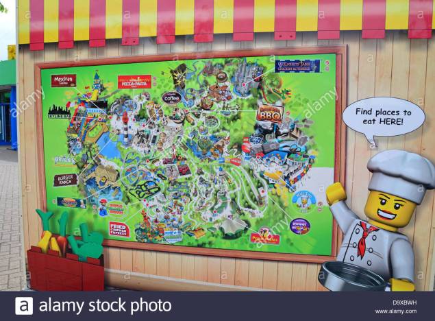
Here theme park maps are typically displayed on a large board in real life.
The only other form of the map you’d typically find out there in the big wide world would be paper leaflets so that people can walk around and follow the map.
Here is a retro leaflet from the 1990s of Thorpe Park.

Probably the most famous map in the world is the London tube maps designed in the 1930s by Harry Beck.

You can also find this tube map in leaflet form. This is the front of the real-life leaflet.

And of course, you can find big printed out versions on any London train station.

So that’s a basic overview of the different types of maps you can find online and in real-life.

Susan Kare is one of the notable contemporary American graphic designers. During the 1980s, she developed many of the interface elements for the Apple Macintosh. She worked as a creative director for the business NeXT that Steve Jobs founded after leaving Apple.
Kare’s most famous creations from her time with Apple is the Chicago typeface. It was the most prominent typeface for the user interface, applied not only in Classic Mac OS but also the first four generations of Apple iPod interface. Another one of her recognizable creations were the original monospace Monaco typeface and Geneva typeface. Besides, her long list of original creations includes the symbol on the Command key on Apple keyboards, the welcome screen icon the Happy Mac that greeted the users when the machine is turned on and Clarus the Dogcow.
According to Susan Kare, good icons should be more efficient like road signs rather than mere illustrations. They should be easily comprehended and keep the users from getting confused by extraneous details. She is of the view that out of million colours all the colours don’t need to be incorporated in the icons and that once a well-crafted and meaningful icon is designed it doesn’t need to be resigned frequently.
A GUI or Graphical User Interface is basically just what you see on a computer screen, and it grants users the ability to be able to interact with components on the screen using the mouse, like clicking on a website link or scrolling down a page. Some examples of Graphical User Interfaces are;
Here’s a screenshot I took of my Windows 10 Start menu.

Here’s a screenshot I took of my college mac’s dock.

https://en.wikipedia.org/wiki/Graphical_user_interface
https://www.computerhope.com/jargon/g/gui.htm
Interactive Map – http://stcg.byethost24.com/1920/Ciaran/index.html
App – https://xd.adobe.com/view/9f16cc6f-aab0-4fe0-45b2-e1fc3bd34ea8-e927/
I want to make a zombie apocalypse map of Kingston, so it will have the exact same layout as a normal map, only it will be focused on places where there is a high concentration of zombies, and what type of zombies populate each area. For example, a coffee shop would have hipster zombies, a pub would have drunken zombies etc.
I found that there was actually a map of the dead, which converted the whole of google maps into a zombie survival map, telling people where there were different kinds of shops, and whatnot. But unfortunately, it was shut down due to it costing a lot of money to maintain.

I want to do my own version of this, but like I mentioned above, I will only concentrate on areas of high zombie population, instead of going into detail about every kind of shop and space.
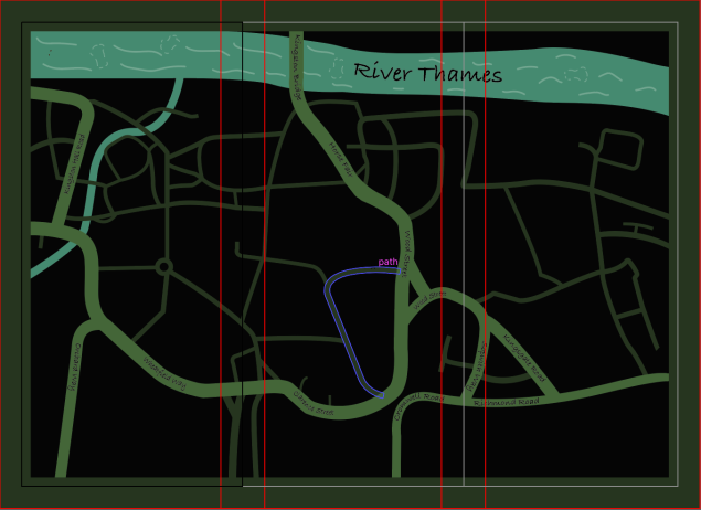
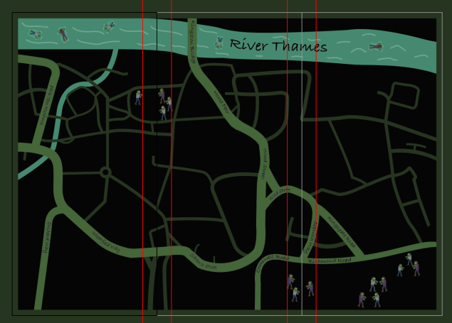
Here’s the Kingston map from Google Maps that I’m going to draw a simplified version of.

When drawing this map, I wasn’t paying attention, so accidentally drew it on the back of the scamp sheet, so I drew some map lines in the map to replicate the scamp sheet on the other side. I think I drew too much detail though.

I then scanned it and imported it into Adobe Illustrator, and used the pen tool to trace the roads. I then converted the paths into objects and gave them a murky green colour. I then made the smaller roads a darker green, to distinguish them from the bigger ones. Then I made the rivers bluey-green. I also made the background black, and added a dark green border. This is what it looked like. There are red lines all over it because it’s in Adobe Indesign, and is ready for printing.

I then added street and river names using the text on a path tool. I also added waves in the River Thames.
Then I designed some zombies. Although I used no reference pictures for them, I was pretty happy with them at the time.

So then I populated the apocalyptic land of Kingston with these half-arsed beings. To make the map a bit more interesting, I put some floating face down in the Thames.
I then went out into Kingston and did some quick sketches of some of the locations that my map would focus on.
I then created some little icons for the places that I was going to be concentrating on. I made icons for the graveyard, the Bental Centre, one for the Rotunda, and one for Pryzm nightclub. Here’s a neat little slideshow.
This is the map with all the icons. The map below is pretty different from the map above, because I’m writing this after I’ve created the map, and in order to find a version with these icons on it, I had to go back quite a bit. The colours are brighter here because when I moved the map into InDesign, it changed the colours from RGB to CMYK, which muted the colour of the neon green roads.

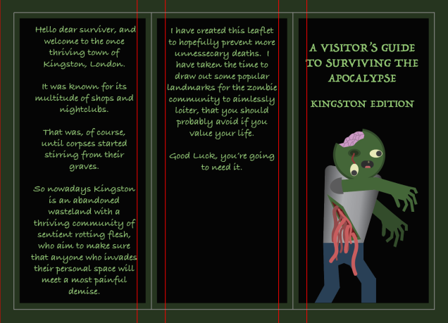
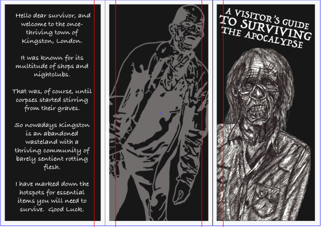
Next, I copied one of the male zombies and yanked out the poor fella’s eye and made his intestines hang out his belly, cracked open his head and pulled out all his teeth but one. I stuck him on the front cover of the leaflet. I gave it a title, added the same dark green border from the map, and wrote the backstory to this scenario on the remaining two sides.
Then I made a key to tell the reader what each icon means.
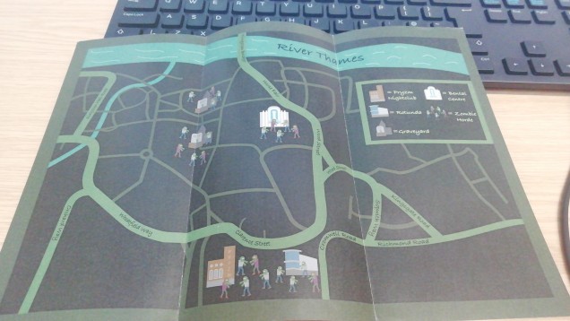
I printed my leaflet out and this is what it looked like.

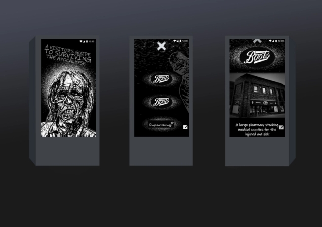
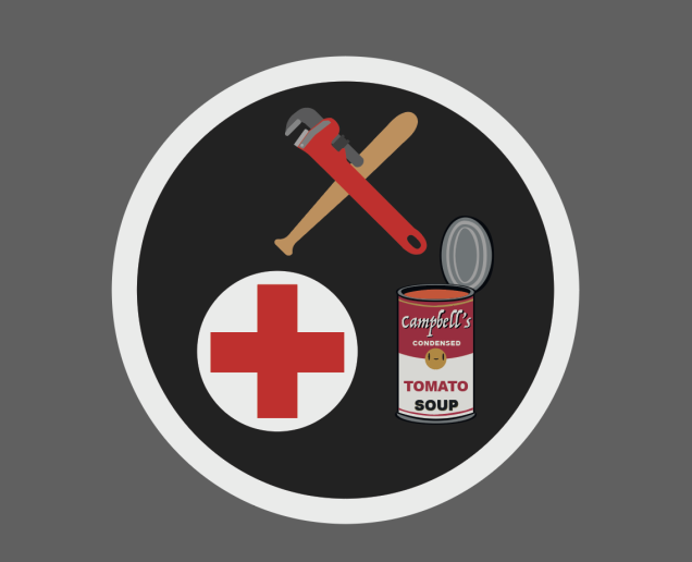
At this point, I wasn’t really happy with the leaflet, the zombies all looked cute but really half-arsed as if I hadn’t really put much effort into them, which, admittedly, I hadn’t. And after getting some feedback realised that there was too much text. The map itself wasn’t very interesting to look at, and the purpose of it wasn’t clear. So I scrapped the idea of focusing on areas with a high concentration of zombies that the map readers should avoid, and instead went for the concept of showing potential survivers where to get medical supplies, food and weapons. I used these reference photos when designing the weapons icon.


This is the result.

For the medical supplies, I just made a simple red plus with a white background.

For the food icon, I remembered that I’d designed my own variation of Andy Warhol’s Campbell’s soup can for my previous art magazine project. So I imported that
and modified it so that instead of it being a closed can, its lid was open and tomato soup could be seen within.

As I was placing these around Kingston, I realised that Wilko sold food, medical supplies and weapons, so I decided to make an icon combining everything.
So then this is the map with the new icons and locations.

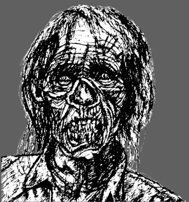
My teacher Doug saw my leaflet and said that the zombie on the front didn’t look very good, so I went and drew a realistic zombie. This is the reference photo I used.

And this is my drawing.

I really liked this drawing, but it didn’t fit with the green and black theme, or with the cartoon zombies, so I decided to completely change the aesthetic, and go for a simplistic, monochromatic colour scheme. I changed the writing from green to white, made the borders on the front white, and the borders on the map black, I made the background white, the roads black, the smaller roads dark grey, and I changed the icons to black and white. I covered the whole of the right-hand side of the map with a black box and put the key on it. I then spent hours tracing over a screenshot of Kingston and adding in the details of all of the buildings. I did this to make the map more interesting to look at and make it look more like an actual map. This is how it looks now.

I much prefer this map.
I found this picture of a zombie on google images.

I went into Adobe Photoshop and traced it. I went for a more stylised design, rather than realistic, but just colouring in the darker areas with large black lines.

I wanted to put this handsome fella on the back of my leaflet, but the background is black, and so is this guy, so I made a mask in photoshop and inverted the colours so that the black turned white.
I then brought it into Adobe Illustrator and slapped him on the back of the leaflet. I lowered the opacity to make him look kind of ghostly.

So this is what it looks like now.
So next up on the todo list is make an online, interactive browser version of my map. So I went out into Kingston (and google maps) and took pictures and screenshots of the shops that I featured in my map. I then went into photoshop and edited them to look dingy and black and white, so that they would fit in with my map’s aesthetic. Here are the edited photos in a neat little slideshow.
I then made them into little information bubbles that will pop up when someone clicks on the corresponding icons. I also made little ‘x’s in the top left corners of each info bubble, which when clicked on, make the info bubble close.
I also made it so that when you click on the name of the shops in each info bubble, it takes you to the shop’s website. I am a bit annoyed that by doing this, I break the atmosphere and idea that this version of Kingston is after society has fallen and zombies have taken over, by suddenly being presented with brightly coloured shopping websites, but it was required by the assignment, so oh well.
I wanted to make a looping animation that would play in the browser. So, because this is a zombie-themed map, I found this video, then imported into Adobe Animate, and rotoscoped it, then exported it as a GIF.
And this is my animation. I filled in each frame with a small selection of black, white, and two shades of grey because I wanted to keep with the map’s limited black and white colour palette. I coloured the back leg to add more depth to the walking. Thanks Danish for suggesting it :).

I also wanted to have an animated loading screen for my online interactive map, and my friend Zipi suggested the iconic zombie dance from Micheal Jackson’s Thriller music video, so that’s what I did. I was originally going to rotoscope Micheal with the original music video, but it was too dark and the quality was too low to be able to trace it decently, so instead, I found this video and rotoscoped a couple seconds of the woman on the right.
I decided that seeing as this was only going to be on screen for a second or two because it’s just a loading screen, I didn’t want to put too much time and effort into it, so I only rotoscoped the top half of her. I also wanted to keep with the very limited white, black and grey colour palette, so I made the background black, and the lines white. I didn’t fill in any of the areas with different shades of grey because I rather liked the look of it as it is.
So the next task in this assignment was to create an app designed in Adobe XD, focusing on our maps.
The tutorial that our teacher made for us to follow instructed us to design the app for iPhones, but because I have an Android phone and so, therefore, I’m more used to it, I decided to make an Android-based app instead.
I wanted the app to keep with the dark, gloomy apocalyptic aesthetic of the rest of the map project, so I took the zombie drawing I did for the front cover of the leaflet, and played around in Illustrator with it, using effects.
I then messed around with effects again to design a background for the homepage of the app.

I downloaded the Android Nougat Material Design kit and found this. I put this at the top of all the pages I made.

I couldn’t find the constant menu at the bottom of the screen on Android phones, so I went on Google Images and found this.

I put this at the bottom of all the pages I made after this one.
Because I made this app on my Windows computer at home, and I’ve used a Mac for making the rest of the project, I didn’t have access to the font I’ve used throughout the project, so I went with a slightly different one, but I think that’s okay, it’s not as if someone is going to be looking at the leaflet and the app at the same time, which would then make it obvious that the fonts weren’t the same.
So this is everything together.

The design guidelines for Apple IOS are a bunch of different rules and concepts to give the interface of Apple products that distinctive polished apple feel. They’re also very useful for app designers who are looking to make apps for Apple devices. Here are the main concepts behind the guidelines.


For example, here are some guidelines for the iPhone X on how to layout an app. If an app didn’t comply with these rules, like if it had a video in the Status Bar, instead of the Layout Margin, then it probably wouldn’t be allowed on the Apple App Store because it would be hard to use, and just wouldn’t look right.

There are also very specific design rules for the visual layout on different apple devices. All of these ideas blend together to create a seamless experience for users.

Looking at the Mac that I’m currently using, I can clearly see the different aspects of the guidelines that have been used, for example, the options bar at the top of the screen, that I can also see in the guidelines example above. Here’s a screenshot that I just took. The design is clean and simple, and easy to look at and navigate. Well, it would be if it was its proper size because at the moment it is tiny and very hard to see.

The only problem with making apps for Apple devices is that they are extremely strict with what they allow on their App Store; if an app somehow doesn’t meet the very high design expectations, then they will deny it. They are so strict about this because they want users to have a polished experience, and to feel like they have the best of the best right at their fingertips. Apple feels like this would be completely ruined by apps that went against their many, many design guidelines.
https://developer.apple.com/design/human-interface-guidelines/ios/overview/themes/

Terms of service, also known as “terms and conditions”, or just “T&C”, are a set of legally binding rules that the website and or app requires its users to abide by. Users are often required to agree to these terms and conditions before they can use a service. Almost everyone who uses the internet regularly will be familiar with the terms and conditions dialogue box that pops up when you’re trying to install something or use a website for the first time.
I can guarantee that hardly anyone has bothered to read all of the terms and conditions that they’ve accepted, as it would roughly take the average adult about 75 days to read all of the terms and conditions they that agree to each year.
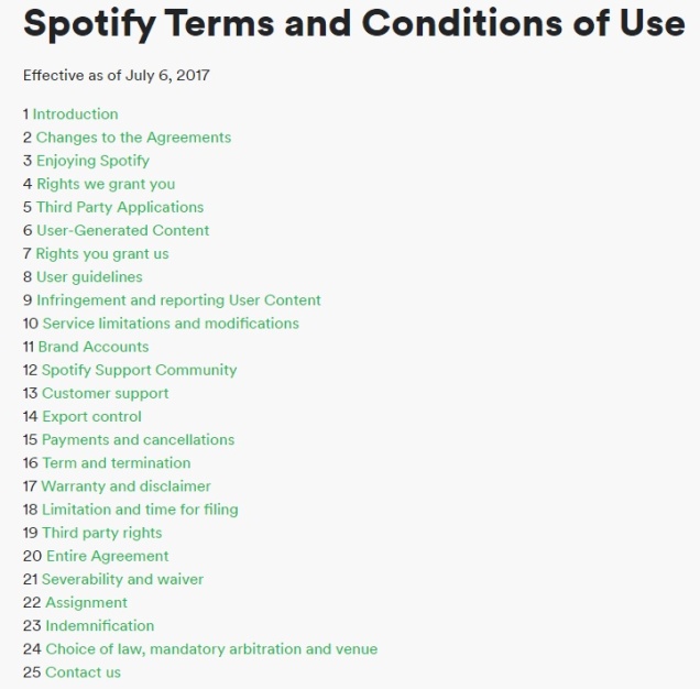
Here’s the contents page for Spotify’s terms and conditions, because I’m not about to show all of a company’s terms and conditions, as it would just be boring and pointless.
If a website or app stores personal information about its’ users, that could be used to identify them, like name, email address, mailing address, birth date, IP address, etc, then the website or app needs to have a Privacy Policy.
Different countries and states and unions have their respective laws on Privacy Policies, but this is the basic requirements of a Privacy Policy.
A Privacy Policy is a piece of writing that is easily accessible to the website/app’s users, and is required by law to say what personal information will be collected, what the purpose of collecting this information is, how this information is used by businesses and/or third parties, and details of how the user can look at and change their information.
This is the basics of the Data Protection Policy in the UK.
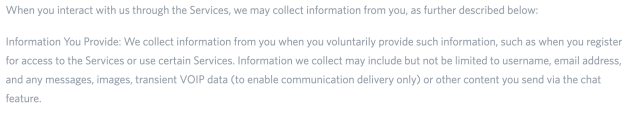
I went onto the online messaging app Discord and this is how they collect users’ data.

Cookies are basically data that websites collect on you when you use them. Cookies can record what language you set the website too, what you clicked on, what items you put inside your basket and pretty much everything you do. It’s pretty much up to the website what types of data they collect on you.
https://www.nextadvisor.com/how-enforceable-are-terms-of-service-agreements/
https://en.wikipedia.org/wiki/Terms_of_service
termsfeed.com/blog/privacy-policies-vs-terms-conditions/
https://www.gov.uk/data-protection
https://discordapp.com/privacy
Interactive media authoring is basically combining a whole range of different types of media, like video, text, sound or animations into one package, like a CD/DVD to be sold in retail shops, or something downloadable on the internet, like a game.
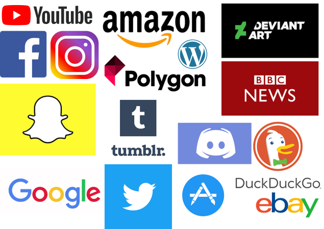
In the modern-day, there are so many devices and products that incorporate interactive media, because pretty much everything that we digitally interact with comes under this massive, all-encompassing umbrella. Here are just a few of the different kinds of interactive media out there in the big wide world.
Apps are most commonly accessed by using a mobile phone, but can also be used by interactive TVs. Hell, social media has even been known to be used from a smart fridge, somehow…

They can be used for a very wide range of different purposes, including but not exclusive to; entertainment (Angry Birds, YouTube), social media (Instagram, Discord), search engines (Google, DuckDuckGo), news outlets (BBC News, Polygon), online shops (Amazon, eBay). I think you get the picture.
The skills and products that someone would need to make an effective app would be on the lines of; graphic design, coding, market research, programming and interactive media authoring software.
As a real-life example of these, here is a screenshot that I took of Instagram on my phone.


Cash Machines are used for taking money out of your bank account and checking of your bank balance. People interact with their interfaces by pressing buttons. to make a cash machine, you would need skills and products like; typography, coding, programming and graphic design etc.

Video games can be used by a myriad of different devices, such as consoles, phones, computers, handheld consoles, interactive TVs etc. The majority of them are consumed for entertainment purposes (Portal 2, Life is Strange), but they can also be educational (Human Resource Machine).

The skills and products that someone could potentially need to make a game are; game design software, coding, programming, 3D modelling software, sound engineering, musical skills, artistic skills, digital drawing software, tablets, computers, voice acting, typography, colour know-how, body-tracking equipment and software and actors etc.
Here’s a screenshot I took of me playing the classic browser game Agar.io.

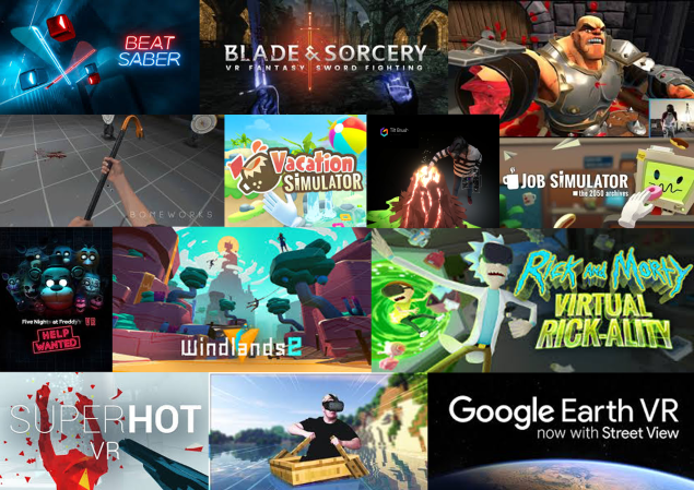
People can experience virtual reality by either putting on some virtual reality goggles either self-contained, or connected to a computer, or they can put some goggles on with their phone inside, to replicate the authentic the virtual reality experience. Virtual reality experiences are normally used for entertainment (Superhot VR, Beat Saber), but can also be used for educational purposes, (Google Earth VR), and can even be used as a creative medium (Tilt Brush).
Some of the many skills and products someone might need to create a virtual reality experience could include; coding, programming, colour theory knowledge, artistic skills, typography, specialist cameras, cameras, tripods and game design software etc.
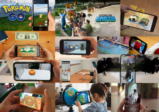
Augmented reality is where someone typically looks through their phone at the world around them, with the addition of virtual objects and or creatures milling about around them. It is interesting, as it allows you to somewhat blur the borders between fiction and reality.
Augmented reality experiences could be used for entertainment, educational, and interior design purposes.
some of the many skills and products someone would need to make an augmented reality experience could be; coding, programming, 3D modelling and animation software, art skills, graphic design, interactive media authoring software and typography etc.
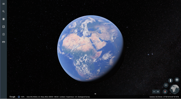
Here’s a screenshot I took of Google Earth because an interactive map can’t get much bigger than literally having the entire planet at your fingertips.
Some of the skills and products that someone would need to make an interactive map would include; Graphic design, typography, artistic skills, a good understanding of colour theory, digital drawing software and interactive media authoring software etc.

I found this at a bus stop the other day in Kingston. It was a touchscreen, interactive device that allows users to see live bus times, a map of Kingston, promotional photos, and train timetables.

Some of the skills and products someone would need to make one of these interactive kiosks would be typography, coding, programming, graphic design etc.
https://prezi.com/3dwp4d2j2e9d/interactive-media-authoring/
