Interactive Map – http://stcg.byethost24.com/1920/Ciaran/index.html
App – https://xd.adobe.com/view/9f16cc6f-aab0-4fe0-45b2-e1fc3bd34ea8-e927/
I want to make a zombie apocalypse map of Kingston, so it will have the exact same layout as a normal map, only it will be focused on places where there is a high concentration of zombies, and what type of zombies populate each area. For example, a coffee shop would have hipster zombies, a pub would have drunken zombies etc.
I found that there was actually a map of the dead, which converted the whole of google maps into a zombie survival map, telling people where there were different kinds of shops, and whatnot. But unfortunately, it was shut down due to it costing a lot of money to maintain.

I want to do my own version of this, but like I mentioned above, I will only concentrate on areas of high zombie population, instead of going into detail about every kind of shop and space.
Here’s the Kingston map from Google Maps that I’m going to draw a simplified version of.

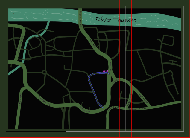
When drawing this map, I wasn’t paying attention, so accidentally drew it on the back of the scamp sheet, so I drew some map lines in the map to replicate the scamp sheet on the other side. I think I drew too much detail though.

I then scanned it and imported it into Adobe Illustrator, and used the pen tool to trace the roads. I then converted the paths into objects and gave them a murky green colour. I then made the smaller roads a darker green, to distinguish them from the bigger ones. Then I made the rivers bluey-green. I also made the background black, and added a dark green border. This is what it looked like. There are red lines all over it because it’s in Adobe Indesign, and is ready for printing.

I then added street and river names using the text on a path tool. I also added waves in the River Thames.
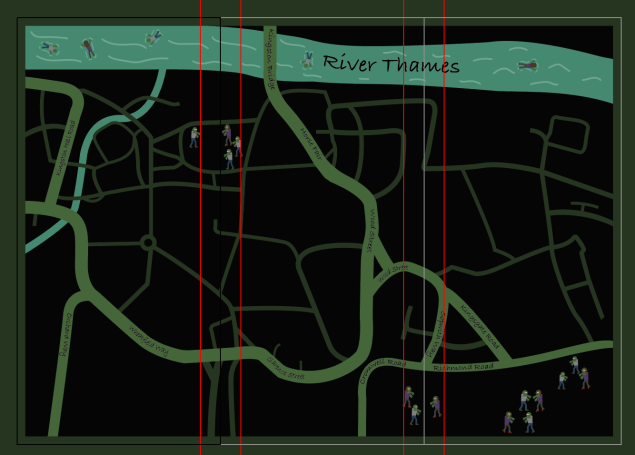
Then I designed some zombies. Although I used no reference pictures for them, I was pretty happy with them at the time.

So then I populated the apocalyptic land of Kingston with these half-arsed beings. To make the map a bit more interesting, I put some floating face down in the Thames.
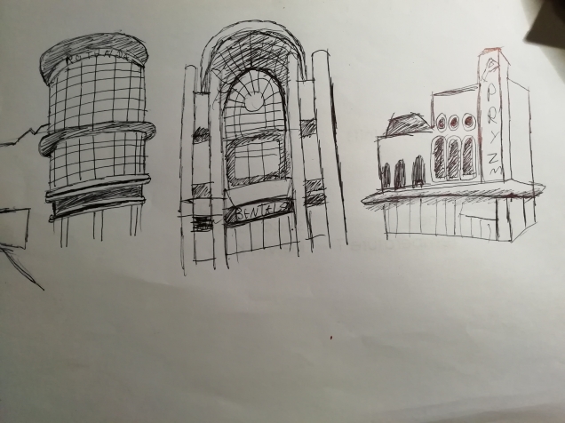
I then went out into Kingston and did some quick sketches of some of the locations that my map would focus on.
I then created some little icons for the places that I was going to be concentrating on. I made icons for the graveyard, the Bental Centre, one for the Rotunda, and one for Pryzm nightclub. Here’s a neat little slideshow.
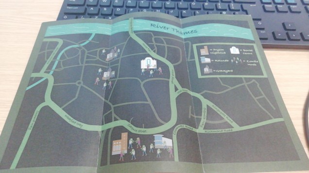
This is the map with all the icons. The map below is pretty different from the map above, because I’m writing this after I’ve created the map, and in order to find a version with these icons on it, I had to go back quite a bit. The colours are brighter here because when I moved the map into InDesign, it changed the colours from RGB to CMYK, which muted the colour of the neon green roads.

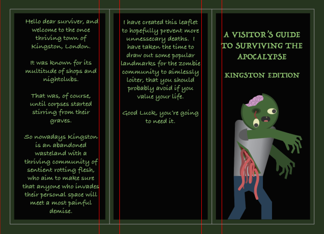
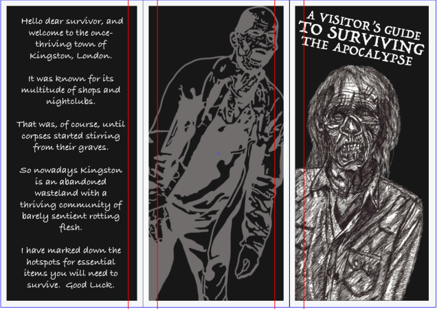
Next, I copied one of the male zombies and yanked out the poor fella’s eye and made his intestines hang out his belly, cracked open his head and pulled out all his teeth but one. I stuck him on the front cover of the leaflet. I gave it a title, added the same dark green border from the map, and wrote the backstory to this scenario on the remaining two sides.
Then I made a key to tell the reader what each icon means.
I printed my leaflet out and this is what it looked like.

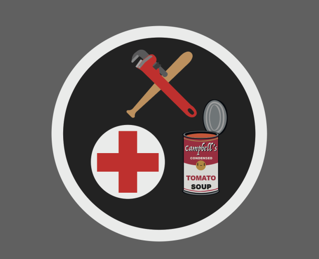
At this point, I wasn’t really happy with the leaflet, the zombies all looked cute but really half-arsed as if I hadn’t really put much effort into them, which, admittedly, I hadn’t. And after getting some feedback realised that there was too much text. The map itself wasn’t very interesting to look at, and the purpose of it wasn’t clear. So I scrapped the idea of focusing on areas with a high concentration of zombies that the map readers should avoid, and instead went for the concept of showing potential survivers where to get medical supplies, food and weapons. I used these reference photos when designing the weapons icon.


This is the result.

For the medical supplies, I just made a simple red plus with a white background.

For the food icon, I remembered that I’d designed my own variation of Andy Warhol’s Campbell’s soup can for my previous art magazine project. So I imported that
and modified it so that instead of it being a closed can, its lid was open and tomato soup could be seen within.

As I was placing these around Kingston, I realised that Wilko sold food, medical supplies and weapons, so I decided to make an icon combining everything.
So then this is the map with the new icons and locations.

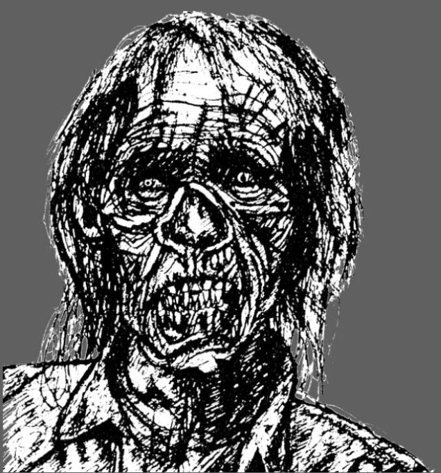
My teacher Doug saw my leaflet and said that the zombie on the front didn’t look very good, so I went and drew a realistic zombie. This is the reference photo I used.

And this is my drawing.

I really liked this drawing, but it didn’t fit with the green and black theme, or with the cartoon zombies, so I decided to completely change the aesthetic, and go for a simplistic, monochromatic colour scheme. I changed the writing from green to white, made the borders on the front white, and the borders on the map black, I made the background white, the roads black, the smaller roads dark grey, and I changed the icons to black and white. I covered the whole of the right-hand side of the map with a black box and put the key on it. I then spent hours tracing over a screenshot of Kingston and adding in the details of all of the buildings. I did this to make the map more interesting to look at and make it look more like an actual map. This is how it looks now.

I much prefer this map.
I found this picture of a zombie on google images.

I went into Adobe Photoshop and traced it. I went for a more stylised design, rather than realistic, but just colouring in the darker areas with large black lines.

I wanted to put this handsome fella on the back of my leaflet, but the background is black, and so is this guy, so I made a mask in photoshop and inverted the colours so that the black turned white.
I then brought it into Adobe Illustrator and slapped him on the back of the leaflet. I lowered the opacity to make him look kind of ghostly.

So this is what it looks like now.
So next up on the todo list is make an online, interactive browser version of my map. So I went out into Kingston (and google maps) and took pictures and screenshots of the shops that I featured in my map. I then went into photoshop and edited them to look dingy and black and white, so that they would fit in with my map’s aesthetic. Here are the edited photos in a neat little slideshow.
I then made them into little information bubbles that will pop up when someone clicks on the corresponding icons. I also made little ‘x’s in the top left corners of each info bubble, which when clicked on, make the info bubble close.
I also made it so that when you click on the name of the shops in each info bubble, it takes you to the shop’s website. I am a bit annoyed that by doing this, I break the atmosphere and idea that this version of Kingston is after society has fallen and zombies have taken over, by suddenly being presented with brightly coloured shopping websites, but it was required by the assignment, so oh well.
I wanted to make a looping animation that would play in the browser. So, because this is a zombie-themed map, I found this video, then imported into Adobe Animate, and rotoscoped it, then exported it as a GIF.
And this is my animation. I filled in each frame with a small selection of black, white, and two shades of grey because I wanted to keep with the map’s limited black and white colour palette. I coloured the back leg to add more depth to the walking. Thanks Danish for suggesting it :).

I also wanted to have an animated loading screen for my online interactive map, and my friend Zipi suggested the iconic zombie dance from Micheal Jackson’s Thriller music video, so that’s what I did. I was originally going to rotoscope Micheal with the original music video, but it was too dark and the quality was too low to be able to trace it decently, so instead, I found this video and rotoscoped a couple seconds of the woman on the right.
I decided that seeing as this was only going to be on screen for a second or two because it’s just a loading screen, I didn’t want to put too much time and effort into it, so I only rotoscoped the top half of her. I also wanted to keep with the very limited white, black and grey colour palette, so I made the background black, and the lines white. I didn’t fill in any of the areas with different shades of grey because I rather liked the look of it as it is.
So the next task in this assignment was to create an app designed in Adobe XD, focusing on our maps.
The tutorial that our teacher made for us to follow instructed us to design the app for iPhones, but because I have an Android phone and so, therefore, I’m more used to it, I decided to make an Android-based app instead.
I wanted the app to keep with the dark, gloomy apocalyptic aesthetic of the rest of the map project, so I took the zombie drawing I did for the front cover of the leaflet, and played around in Illustrator with it, using effects.
I then messed around with effects again to design a background for the homepage of the app.

I downloaded the Android Nougat Material Design kit and found this. I put this at the top of all the pages I made.

I couldn’t find the constant menu at the bottom of the screen on Android phones, so I went on Google Images and found this.

I put this at the bottom of all the pages I made after this one.
Because I made this app on my Windows computer at home, and I’ve used a Mac for making the rest of the project, I didn’t have access to the font I’ve used throughout the project, so I went with a slightly different one, but I think that’s okay, it’s not as if someone is going to be looking at the leaflet and the app at the same time, which would then make it obvious that the fonts weren’t the same.
So this is everything together.

