Material Design is a series of design concepts and rules for web and app design for web designers and artists to gain inspiration from. It was developed by Google in 2014 and is currently used by Android.
The very basic concept of Material Design is to make web and app pages that mimic real-world materials and movements, which convey specific meanings. For example, having shadows under different parts of the screen creates depth to the flat screen graphics, and could tell the user what they can and can’t interact with.

Another concept of Material Design is to make the design and layout of a page as simple and least confusing as possible. This includes simple icons which convey a lot of meaning as to what they are used for. Here are some examples of good, simple icons.
![]()
Here’s a good example of the difference between a good, simple icon and a bad, overcomplicated icon.

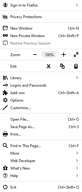
Here’s a screenshot I just took of an option bar in Mozilla Firefox which has obviously used the principles of Material Design; the icons are bold and simplistic and clearly tell the user what option they are respectfully assigned to.
I took a screenshot on my phone of the google apps, which are another example of good Material Design. Each app has a very specific colour palette, and good, simplistic logos; this allows users to quickly identify, and eventually recognise what the app does. The apps look strange and star-like because I have a weird theme on my phone.

So, yeah, that’s a basic look at Material Design.
Research
https://material.io/design/introduction/
https://www.interaction-design.org/literature/topics/material-design
