As an animator, you need to understand how people and objects move, and how to emphasize those movements, so that they fit the narrative that you are working within… and also a couple hundred truckloads worth of other information and skills. But fear not! Because the legendary Disney animators Frank Thomas and Ollie Johnston created the 12 principles of animation, for us to stick our artistic teeth into. These were first talked about in their book, The Illusion of Life: Disney Animation (1981). Whether you are just starting out with animation, or have been doing it for decades, you need to know these 12 simple principles.
So metaphorically open up that mushy brain of yours, and prepare to learn some important stuff.
1. Squash & Stretch
This is the principle that animated objects and characters will become longer and shorter to emphasize their speed, momentum, weight and mass.
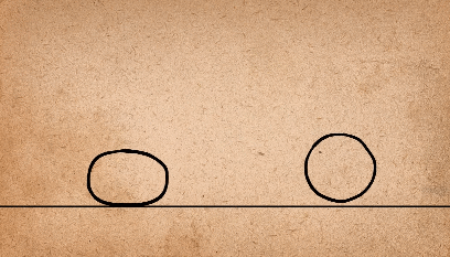
This idea can be used to visually communicate what an object is made out of. For example in the animation below, one ball has a lot of squash and stretch, which makes it look a lot more light, bouncy and cartoony, which makes it seem like a water balloon. But the other ball has much less squash and stretch, so it appears hard, heavy and solid, which makes it look like a bowling ball.
Squash and stretch can also be used for other types of falling objects, like characters; when the character is falling, the poor fellow could be stretched out vertically to highlight the speed at which he is falling, and when he lands, he could squash horizontally, to accentuate how hard he landed.
When squash and stretch are used excessively, it can make the subject seem unrealistic, which gives it a very cartoony look.
But this principle doesn’t just apply to bounce balls and other falling objects; it can also be used to accentuate facial expressions.

See how it is used here to emphasize his shock? His face squashes as he prepares for the action, then his face stretches, which really highlights his horrified shock.
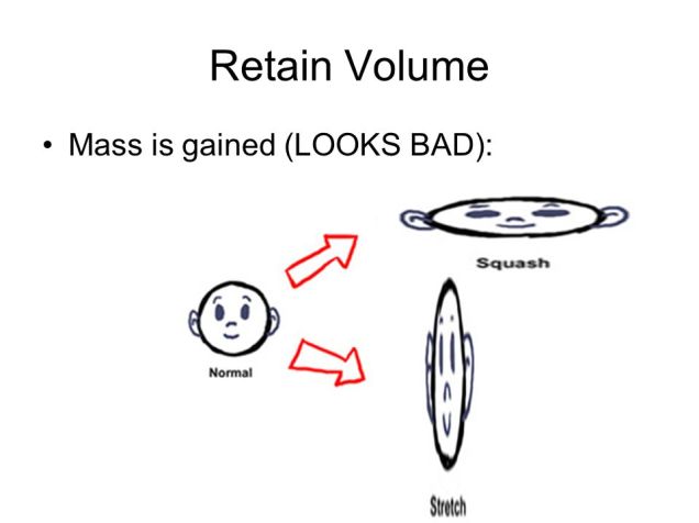
When using this technique, you have to always keep in mind that the object or character needs to always keep the same volume when changing shape. It needs to retain its volume. You can’t have a bouncing ball increase in volume as it stretches out, then decrease in volume when it squashes. It would just look really bad an unprofessional.
2. Anticipation
This refers to when a character prepares for an action. This gives the audience time to understand what is about to happen next. It also helps the movement appear more realistic. An example of this would be a character jumping into the air. With anticipation, the character bends down, preparing for the jump, then he jumps. This action is like a spring squashing down, then bouncing back up with much more force. But without anticipation, the audience isn’t given any time to understand that the little guy is about to jump. It also just looks very unrealistic.
Anticipation is also very useful for drawing the audience’s attention to certain aspects of an animation. In the example below, it illustrates how the animation draws attention to the dog’s hand, then to his pocket. This lets the viewer understand what’s about to happen. But if no anticipation is used, the viewer wouldn’t notice his hand go into his pocket to retrieve the candy, which would make it look as if he had pulled the sweet from thin air.

But additionally, you can use anticipation to draw the audience’s attention to one spot, then suddenly surprise them by making something happen in a different spot. An example of this would be if the dog in the gif above anticipated the reach, then reached into his pocket, but couldn’t find anything, so searched deeper, then the lollipop suddenly appeared on the other side of the screen. It is essentially used to trick the audience.
A deeper, more complicated level of anticipation would be an action that anticipates for the anticipation action, that is then followed by the action. Or the movement format; Start, pre-anticipate, anticipate, pre-action and then lastly, the action.
3. Staging
Staging is the presentation of an idea so that it is completely and unmistakably clear. It is a very broad concept, so can apply to multiple areas of animation, including acting, timing, camera angles & position, and setting.
By using staging correctly, you are able to direct the audience’s attention to certain areas of the scene. You are essentially telling them when and where to look. Everything works together to make the scene understandable. Bad staging is when too many things are happening at once and are competing for attention. The audience’s eyes are onslaught with visual information and they don’t know where to look.

The camera and its angles are like a window into the world of the animation and are therefore very important for good staging. Having the camera close to the subject is good for showing facial expressions, and having the camera far away from the subject is good for big actions, like acrobatics, or battles and all that jazz. You need to remember to always keep the main actions in the middle of the screen, or in one of the thirds.
The main action of the scene needs to be unmistakably clear and simple. For example, you shouldn’t have other things going on in the scene that draw attention from the main action. To achieve this, it helps to let one action finish before the next one starts, so that the audience has time to process what is happening in the narrative before the next action starts. If there is text, then you need to keep it on screen for at least the amount of time that it takes to say it out loud three times.
But The concept of staging isn’t just about manipulating the audience’s attention to further immerse them in your narrative, it is also about communicating ideas. If a character is sad, then highlight and exaggerate it as much as you can, so that the audience really understands and feels it. You could do this by giving them a sad expression and making them stoop over sadly when they walk, with a raincloud over them. If you are trying to create an environment that says something meaningful about the characters that inhabit it, then really push the metaphorical artistic boat out, and add as many details that build on that meaning, and try not to add anything that subtracts from that.
For example, if you are drawing the home of a wealthy millionaire, you could add things that illustrate their wealth, like fancy furniture and a swimming pool, but you shouldn’t add, let’s say, an old broken tv, or a wall with its plaster peeling off. You can also use the camera for this effect; like you could have a close up of a pile of money, or even have the millionaire using a wad of flaming money to light his cigar.
Basically, when thinking about staging, just use everything at your disposal to visually tell the audience everything they need to know.
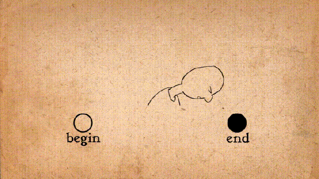
4. Straight Ahead & Pose To Pose
This concept describes the main two ways to animate. Straight ahead is where you draw the 1st drawing, then the 2nd, 3rd, 4th and so on. It is essentially animating as you go.
With Pose to Pose, you draw the first and end frames, then the middle frame, then you go back later to fill in the drawings in between.
Pose to pose is good for animating bigger actions, as you can go back and make adjustments later, and you get an early image of how the animation will play out. This means that you have a clear beginning and end frames. One of the problems with straight ahead is that the size and volume of the animated subject can easily change as you animate it if you’re not careful.
Pose to pose can save you a lot of work and mental stress. If you use straight ahead and at the end, you realise that one frame isn’t right, then you’d have to go back and redraw multiple frames to amend your artistic sin. But with the pose to pose, you can see how everything will look, and catch problems early on.
When using pose to pose, the first and end frames are called “keys”. The secondary frames are called “extremes”, and the frames in between those are called “breakdowns”, and the frames in between THOSE are called “inbetweens”.
You first draw the keyframes and perfect them, then draw how far the character will go in each direction using extremes, then decide how you want the extremes to connect, using break downs. It is at this point that you use inbetweens to connect everything together and make everything smoother.
But straight ahead is very useful for animating unpredictable things, like splashing water, fire and explosions etc. Because there are laws of physics that they abide by, you can guesstimate how the animation should look as you go along. But it would be hard to guess their visual outcome with pose to pose. However, you can still use pose to pose to make the general shapes, then fill it in later to make the animation run smoother.
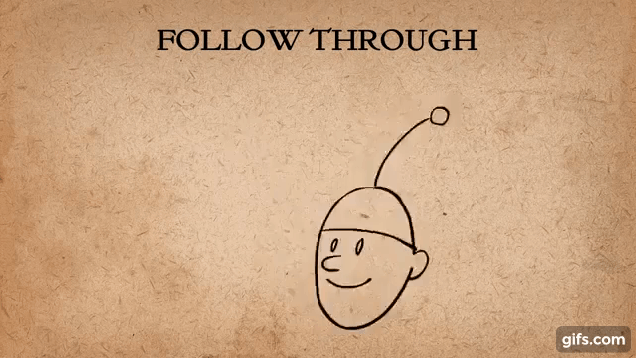
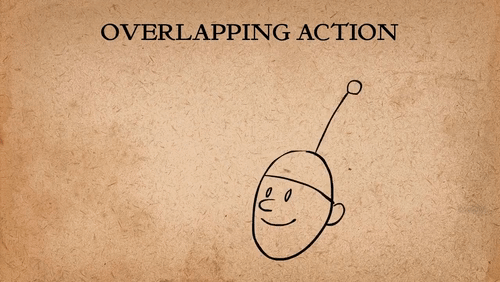
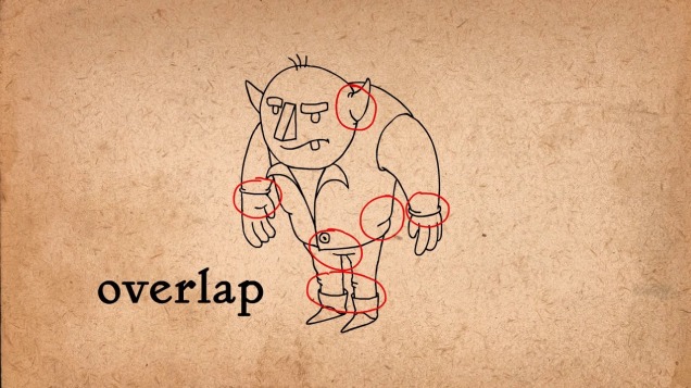
5. Follow Through And Overlapping Action
This is the technique of having body parts and appendages drag behind the rest of body when it moves, and continue to move when the body stops. Basically, when the main body moves, the tip of the appendege or body part should be the last to catch up, and when the body stops, the tip should follow through the farthest before settling back.
The terms follow through, overlapping action and drag all essentially mean the same thing, but are just slight varients of each other.
Follow through is when the appendage or body parts continue to move after the body has stopped. Sometimes the extra flabby skin on a charcter can be treated as a seperate entity with this technique.
Overlapping action describes the offset between the timing of the main body and its other parts.
And finally, drag describes the technique of delaying the movement of body parts in relation to the main body.
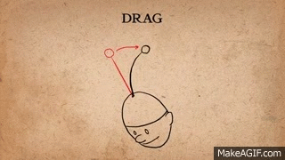
Follow through an overlapping action add a whole bunch of realism to a character. The amount of drag you give an object can say a lot about its mass.
when animating an appendage, it is often easier to add it after you have animated the main body, because its movement allows you to interperate how it should act when drag is applied, and then follow through when the body has stopped. When doing this, straight ahead animation is good to use.
Overlapping action helps to break up an animation, to make it more interesting.
6. Slow In And Slow Out
This technique refers to how almost all movement starts slowly, gets faster, and ends slowly. This concept is of utmost importance if you want to achieve lifelike motion, because, without it, movements are at a constant speed, and just seem bland and mechanical.

If you wanted to use slow in and slow out with 2D animation, then you would need to draw the two keyframes, then draw a couple of inbetweens. The amount of inbetweens needed depends on whether the action is quicker or slower. If quicker, fewer inbetweens are needed. If slower, then more inbetweens are needed.
If you notice that your animation is choppy, then you need to analyse the spacing of the frames. They should be evenly spaced, with the frames closer together at the beginning of the action, and at the end of the action.
7. Arcs
This concept is all about the idea that most living creatures mostly move in a circular fashion, otherwise known as an arc.

Using arcs is useful for making objects following a circular path more realistic, and adding character and personality to character’s movements. Arcs can be added to almost any character movement.
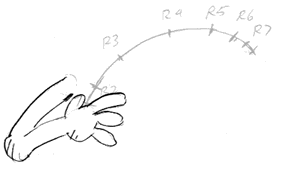
When there is a fast movement, you can add an arc in the form of a motion blur, like so.
8. Secondary Action
This principle is basically all about gestures that support the main action to add more dimension to the character animation. The secondary action can exaggerate the character’s feelings, and add more meaning to the animation.
For example in the animation below, a guy is looking worried. The secondary actions are the foot and hand tapping, and these make it very clear to the viewer that he is worried because, without them, the meaning of the animation might not be as clear, like it could be interpreted that he was feeling other emotions, like sadness.
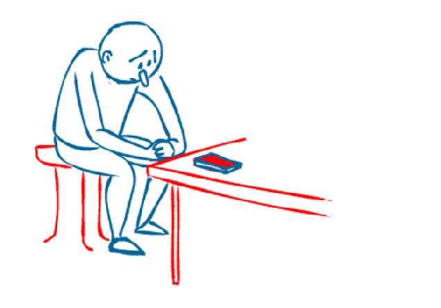
But it is important to keep in mind that the secondary action shouldn’t detract from the main action. It should compliment it. For example, if you had an animation of a man crying, the secondary action could be him putting a tissue to his face, but in doing so, the main action is obscured by it, and the original meaning could be lost.
But in addition to this, you also need to remember that the secondary action needs its own time on screen, so that the audience has time to notice it, and process it in relation to the main action. This shows that the principle of staging is very important for secondary actions.
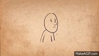
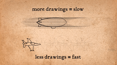
9. Timing
This principle is basically the idea that the personality and nature of an animation is greatly affected by the number of frames inserted between each main action.
In layman’s terms, this means that an animation with lots of frames in between each main action will be much slower than an animation with a couple of frames set far apart from each other, which will be very fast.
The number of inbetweens between two keyframes can greatly impact the meaning of the animation, as seen below. With each addition of a frame, the speed of the head turn becomes less and less severe, which alters the meaning of the movement.
Most films and animations are made with 24 frames per second (24fps). If you drew an animation with 24fps, then it would be defined as “drawing on ones”, because you are making drawings on every frame. If you draw a frame every other frame, then it is called “drawing on twos”, and every three drawing is “drawing on threes”, and so on.

Drawing on twos as opposed to ones is very common, as it halves the amount of work, and therefore money that goes into the animation, and it actually makes slow actions look smoother. This is because the amount of precision needed to draw a slow action on ones can lead to the action being jittery, which makes it look unprofessional.
Some people think that drawing on twos is actually better for fast animations as well because they say it gives the animation a human, more authentic animated touch, instead of it being very smooth and polished, which would be achieved by drawing on ones.
But drawing on ones is also necessary when there is a very fast animation, as every detail needs to be smooth and clear so that it is easy for the eye to see everything.
It is also noteworthy that an animation can be drawn on ones and twos, depending on the movement, which gives the animation a very dynamic and artistic feel.
At the end of the day though, it is ultimately the animator’s choice on how many frames they want to put into the animation, based on style, preference, deadlines, and so on.
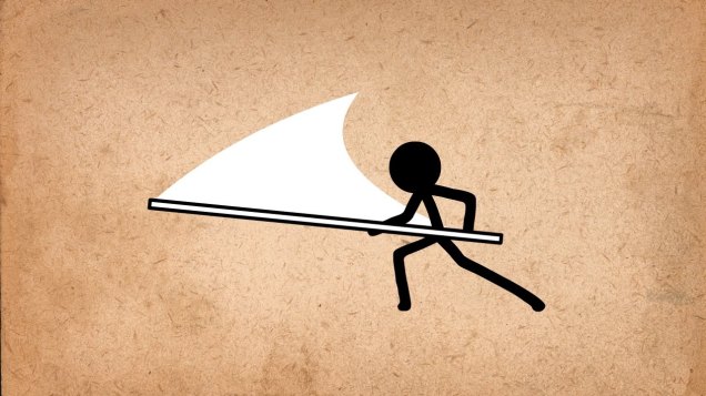
10. Exaggeration
Essentially, this principle means that every action can be exaggerated to have a more powerful impact on the viewer. If you ever took drama classes, then this concept should be familiar to you.
So if a character has a sad face, make it sadder. If it has a happy expression, make it happier. If it is worried, make it more worried, and so on.
When you have a fast movement, the exaggeration needs to have at least one unrealistic frame, one frame, that if paused on it, would look way too long, and just not right. This boosts the exaggeration’s presence. An example of this is below on the right. See how the frying pan bends unrealistically? If you paused it on that frame, it would look weird, but because it is in motion, it looks completely fine.

A good rule of thumb for knowing when an exaggeration is too much is to push the exaggeration to the max until it becomes very unrealistic, then tone it down a bit, until it looks good. By doing this, you are able to see the full range, instead of randomly shooting in the dark, and hoping for the best.
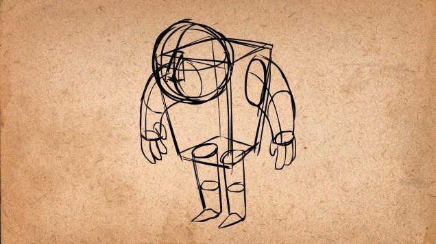
11. Solid Drawing
This principle is about making characters and objects feel like they are in a 3D space and environment where they have volume, weight and balance.
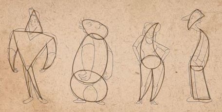
A skill that comes in very handy when using this principle is knowing how to draw a character from all angles and sides, but this requires a lot of knowledge about 3-dimensional drawing. When trying to draw a character in 3D, use basic 3D shapes to construct them, like cubes, rectangles and spheres, like so.
When drawing in 3D, it can also be very useful to draw perspective lines, so that you can tell how big to draw the character in relation to how far away from the camera they are.
When you move onto drawing the final lines of your character, try to remember that using overlapping lines can really make the character pop, and make it feel like it’s in a 3D space.
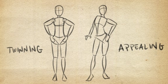
These concepts apply not just to 3D drawings, but also to 3D animations. They help to convey the pose of a character and give them a sense of weight and balance. When animating, try not to do what is called “twinning” which refers to when a character’s limbs are both doing the exact same thing on each side. To avoid this, actively try to think about other things that the adjacent side of the body could be doing, like make the character slouch to one side, or make them try to keep their balance. Anything to show that they are abiding by the laws of physics in a 3D space.
12. Appeal
And finally, the last principle of animation basically says that any character that you draw needs to be visually appealing. They should have some charismatic aspect or some kind of visible personality in their design. The appeal doesn’t just apply to the hero, but it should also apply to every other character in the animation. The appeal doesn’t mean that they need to be good looking, they just need to be interesting to look at.
A three-step process to helping you develop appealing characters is to firstly use a variety of shapes, because there is no limit to the combinations of crazy configurations that characters can have, and every good character design starts with a clear shape.
The second step is to play with proportions. Try to find the aspects of a character define their nature, and exaggerate them. Make them bigger. This can help to make a character more appealing. For example, if you had an old, hunched over witch-like woman, you could blow up her hunch, to accentuate her visual design personality.
And lastly, the third step is to keep the design simple. Don’t add a ton of detail to the character design, just pick and choose which details are important enough to keep, as it will make animating it a nightmare, because you are going to have to draw everything hundreds of times, over and over again.
Phew…
And that concludes the 12 principles of animation! If you managed to read all of it, well done you! You get an invisible gold sticker. Hope that makes your ordeal feel worthwhile now.

P.S
This blog post was made with a couple million truckloads of reference to Alan Becker’s video on the 12 principles of animation. You can find that video by clicking right here 🙂
